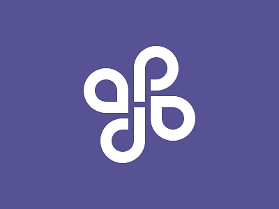
New logo for Adi Purdila
After a lot of going back and forth, I settled on my new logo. It's a play on my initials (A and P), arranged in a somewhat geometric fashion.
I love how the bottom part kinda forms the "DO" word, which speaks to my mentality. This was unintentional, but I like how it turned out. #justdoit
The symmetrical "a" letters can be associated with the opening and closing code brackets in HTML which speaks to the nature of my expertise.
I chose purple as my brand color because it combines a cold and a warm color so you get the calmness and trust but also the passion and energy. Purple is also associated with creativity and has positive effects on the mind. Plus, I really like it :)
This is based on a logo created for me a while back by Chris Zammit Dimech - https://www.behance.net/chriszd. I'm not a logo designer by trade but I really like how this turned out.
Any feedback is greatly appreciated. Thanks!
