Educational app screens and design tricks explained
Hello,
to understand what's this app for, be sure to look at the Previous Shot before to continue.
-----------------
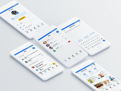
Enough animations let’s see some beautiful screens from the parent side.
In the center, we have the main screen where he has an overview of all his kids.
Once he selects a kid, he can see the screen on the bottom. It contains at the top the number of played quizzes, understood books, and won points. A little down he has an overview of the last played quizzes and gifts.
We all know that kids need motivation and a little message will mean a lot. So we integrated some predefined messages as you can see on the top
Now let's move to the Gifts part in the left screen. I did my best to keep the design consistent. Here the parent can find:
1- Gifts requests from his kids
2-Gifts already added for the kids
3- Gifts proposition to add for his kids
(Ps: the blue gift picture is the default gift picture)
Finally, the settings page. Here the parent can edit his profile and as you see a big call to action so he purchases our app.
----------------------------------------------------------------------------
Did you finish reading? Was it too long?
please let me know on the comments if you like me to make more screens like this while explaining the design <3
****
If you want the full case study, you can find it on Behance
Don't hesitate to DM me on Instagram Instagram
See you in the next shoot Tomorrow ^_^