Population Growth
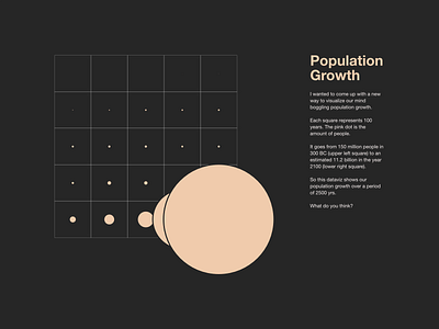
I wanted to come up with a new way to visualize our mind boggling population growth.
Each square represents 100 years. The pink dot is the amount of people.
It goes from 150 million people in 300 BC (upper left square) to an estimated 11.2 billion in the year 2100 (lower right square).
So this dataviz shows the population growth over a period of 2500 yrs.
What do you think?
