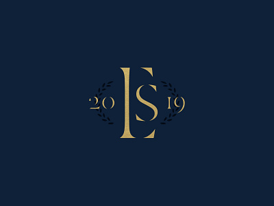
Expositors Summit Monogram - Exploration
Another direction from the rebrand project for this biennial speaking convention.
—
Not completely sure how legible the E and the S are, but still thought it looked appealing aesthetically.
More by Gabriel Reyes-Ordeix View profile
Like


