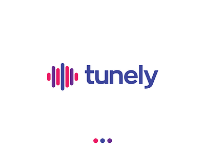
Tunely Branding ID Concept
Today's logo concept breakdown is for Tunely, a content streaming platform built for the now.
⠀
This logo mark was created to be an appropriate identity solution.
⠀
The goal was to create a mark that would be accepted by the community of end-users and create a loyal following on the Tunely platform.
⠀
With this mark, fine-tuned alignment meets rounded ligatures in both the wordmark and the EQ wave pictorial mark.
⠀
I used a combination of warm and cool tones to create a color system that works well in applications from print to digital media.
⠀
The typeface was designed to feature slightly rounded edges to compliment the wave mark.
⠀
This logo can be used as a combination mark, a singular typeface or singular pictorial mark with the EQ wave.
⠀
The wave mark allows this logo to be identified in smaller applications like app icons or favicons even when the Tunely name is not present.
⠀
This allows this logo mark to work as a scalable system and, over time, allow the brand to be easily identified by the wave mark by itself (similar to the red, white and blue abstract mark that Pepsi uses.)
⠀
The simplicity of this mark allows it to have versatility and because it works in one color, or multiple brand colors, it could be used in applications with a small budget or with a larger budget allow room for more elaborate printing options.
⠀
Overall, this was a fun project to work on and I’m going to continue working on developing this and exploring more in-depth design options.
⠀
What are your thoughts about this mark?
