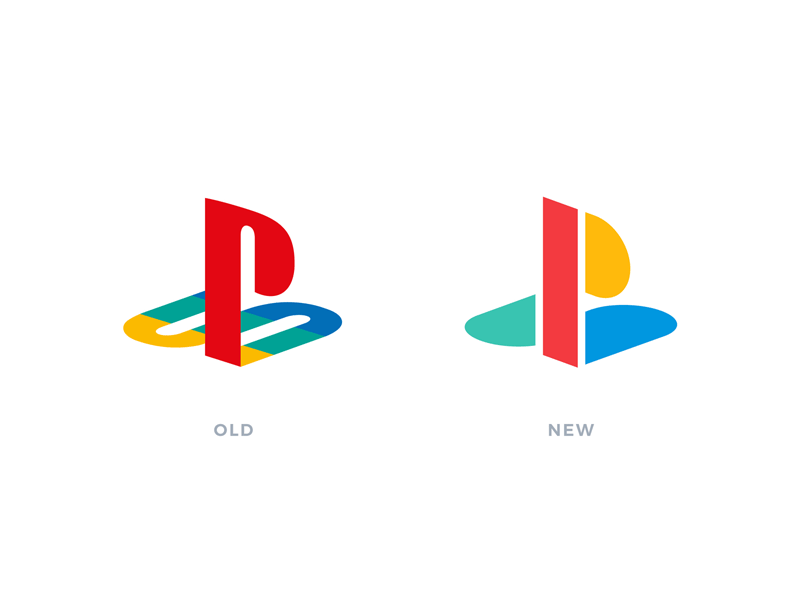
PlayStation logo redesign: A or B?
A lot of you asked for the version with gaps on the S, the option B. I think looks pretty good and more similar to the original. But personally, I still think that I like more the option A. Because it's simpler and since you already know the original logo, I think is not necessary to add the gaps on the S.
What do you think? A or B?
-
-
Please, like the comment with the option you prefer 👇
-
-
More by Gustavo Zambelli View profile
Like

