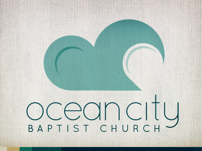
Ocean City Baptist Church: Logo, Take 1
Struggling a bit with this side project I'm working on.
Love the abstract shape the O and C create. I can see the wave, but I can also make out a cloud. Played around with water droplet shapes to create what you see here. The only thing is that I feel like there's something missing between the letters, but everything I tried in there added too much visual noise.
Not sold on the font either. Since the mark is kind of whimsical, the rounded sans might push it too far into whimsy; but it seems to fits the beach-front feel well. Might need a subtle sans or some kind of slab to rescue it.
Should I make it a distinct O in the mark, or is that conveyed well enough? Also: the pastor said he preferred lowercase: what's your feeling on that?
More by Jesse Gardner View profile
Like
