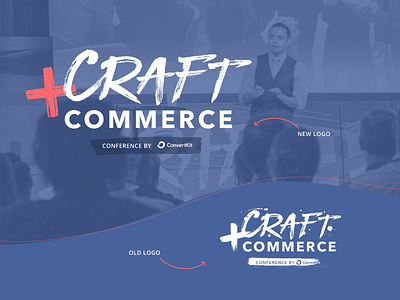
Craft + Commerce brand update
The ConvertKit conference, Craft + Commerce, needing a brand update to match with the new ConvertKit brand colors.
Our previous conference logo had inky splatters which we felt looked a little dated, and also looked kind of murdery in our new main brand color pinky red... Tasked with doing a 'lightweight refresh' I went around in circles for a long time trying different fonts to replace the "Craft" but in the end decided the best option would be to just cut back on some of the streakiness of the original logo and remove the splatters!
I've combined this new refreshed logo with swoopy curvy lines, block textures and offset outlines which you can see in the attached file.
More by ConvertKit View profile
Like

