Atipico Visual Language
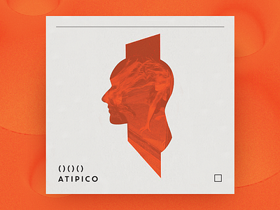
A part of visual identity designed for close-to-our-heart ATIPICO – an extraordinary, creative restaurant space in sunny Barcelona!
The inspiration for logo design was a multiplied shape of an eye, which stands for the vision, consciousness and experience.
We used bold, saturated palette and very simple, modern typography to make the overall look bold and clean.
Feel free to share your feelings!