Visit Greece website redesign
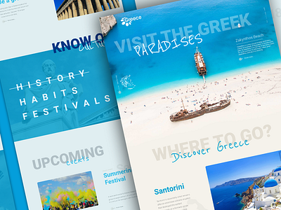

Been working on a "re-do" of Visit Greece's website. Used color tones based on the sand, the really bright water and the white buildings of Santorini. Tried to give a more "summer fun" look to it since people often go there on vacation and the current website looks a bit too formal and governmental. Also, the information is too condensed, so I tried to expose the best content in a cleaner way so users could be really interested about discovering places and adventures to do in their trips and not just looking at the site for documents.
