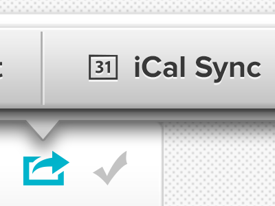
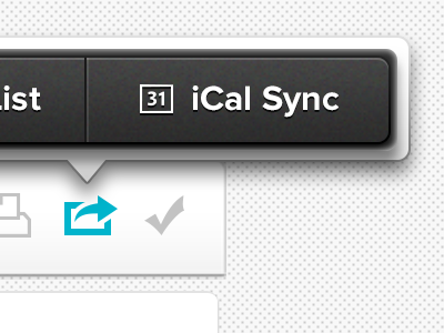
Task Manager Tool Tip V2
I took a lot of what you all said into consideration in revising the tool tip seen here. I also went with a little lighter and cleaner color as I felt it matched the overall UI a bit better.
What do you think? Step forward, or step back?
Cheers all! Full screen attached!
More by Jeffrey Jorgensen View profile
Like


