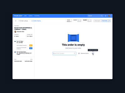
Empty Order UI
Hi !
Here is a sample of an Order Entry UI that i'm working on for Trade.Easy app.
In this case, the order is empty and the user is invited to search for products thanks to an auto-completion search field. He can also go for an advanced search or create a new product into the catalog.
The left panel which is the resume of the order can be toggled by clicking on the hamburger menu.
Press "L" to send some 💙and do not hesitate to give me some feedbacks ;)
Concept Designed for TRADE.EASY
More by Arnaud Mazé View profile
Like
