Z1 Branding - Website

We rebranded our studio to capture the new path we walk with our digital products.
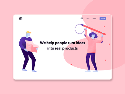
Our new brand is not just a logo, but a whole new imagination around our philosophy and way of understanding the projects. For that reason, to build the new website we wanted to have lots of organic and curved forms that would contrast with the strict geometry of the logo.
Not only that, but sinuous forms would also contrast with the geomanist typography we inherited from Commite, our previous brand, as a particular homage to our beginnings.