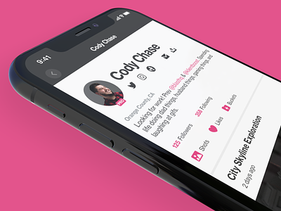
Dribbble iOS App Teaser
🚨TRIGGER WARNING 🚨
This is a redesign AND it's unsolicited.
Well, it's not a total redesign... just a touch up. Either way, I've been taking note of some little bits within the official Dribbble iOS app that have felt funky or just a little off and I thought I'd take a stab at resolving those things. This is a teaser for much more to come including an eventual full case study.
I've never had a formal product design role, but I've been dancing around it for a while and would like to land one. So I'm practicing! (Besides, the last time I did this the company who's app I redesigned almost hired me 🤷🏻♂️)
P.S. I know some individuals frown pretty strongly at unsolicited redesigns. To those individuals I would say that this effort is in no way meant to imply any ill will towards anyone on the product team at Dribbble and I fully recognize that I have no clue what information and constraints they are working within when they produce the real deal. This is purely practice for me in hopes that I might learn a few things and find myself in a full time product role soon. 🤞🏻
