Changing Scale
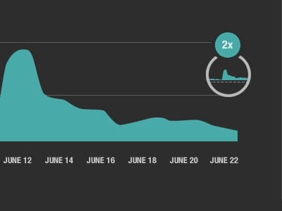
For this infographic there is two graphs that I'm trying to compare, but they are on two different scales. To show this the graph in the circle is to scale (compared to a separate graph not shown in this shot), and then the bigger graph next to the circle graph is scaled up 2x. This probably doesn't make sense with out seeing the whole picture.