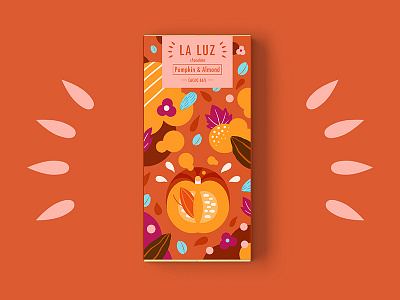
LA LUZ packagedesign03 ——pumpkin&almond
The LA LUZ chocolate brand is called Spanish and the translated meaning is light.Inspired by the legends and stories of the cocoa tree in the Mayan culture.The tree of the Holy Spirit is planted in the "Dark Ages", indicating the four directions of the wind,Thereby bringing light to mankind.
LA LUZ's glyph design is derived from the smashed chocolate form.The lines are clean and neat, reflecting the hardness of the chocolate and the modern feel.Create a brand image for chocolate in a modern and simple way.
The package design shows the actual content or delicious ingredients of different flavors of the product.Better communicate the advantages of innovative products.
More by TPT View profile
Like
