Grocery Store Landing Page
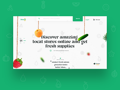
What i tried doing here was depicting the feel of a really local Nigerian-scene-kinda-grocery-store , all the ropes, smoke sorta thing...
This would look good on some sort of Parallax motion interaction, coming soon!
Shouck was a task i recreated from a known User Experience Designer
@Joshua Oluwagbemiga.
The platorm is meant to offer fresh farm produce to customers and as such should own an extremely pleasing visual Interface with a core friendly experience. (Full shot available somewhere around the web)
Personal Goal: Making the User feel in a farm
Process:
- Research
- Farm thoughts (UX)
- Paper sketches (it’s what works atimes)
- Customer Journey Mapping
- UI Design
- Presentation Design
Challenge: Finding the perfect experience that delivers the project’s goal.
Result: A Proposed MotionBased User Interface giving the farm experience that leaves the user looking around, feasting eyes on lots of produce hanging around.
To meet the paramount need of saleing the CTA are positioned glaringly to aid ease of search.
Reflections / Findings:
- Noticed the key need of Motion in Interfaces
- I understood why users shouldn’t find theirselves as in a puzzle game zone when on your interface, hence the positioning of the CTA that way.
XD.
What do you think?
