S Logo Concept / Spendable
One of the initial concepts I'm working on for Spendable, a not-for-profit organization helping make money management easier.
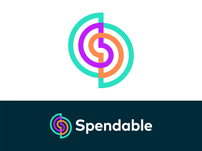
The logo shows the initial letter of the name, S, made from 3 concentric circles (initially).
The inspiration behind the concepts was that Spendable offers three linked services to help people manage across three time periods. They consistently use a single color for each timeframe: orange for weekly spending, purple for monthly bills, green for yearly big expenses. It was therefore important for the logo to contain each color, so the idea of these three timeframes and services is present all the way through. Spendable also sees time as circular, going round and round each week, month and yearly. So three concentric circles were a preconceived direction.
