Product Creator Mobile Concept
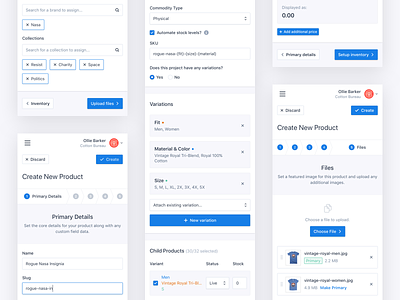
Creating and editing a product shouldn't necessarily have the same interface. An editor should allow you to edit the information you want as quickly as possible. And creating a product should guide you through the process steps and help educate your customers/users at the same time.
These screens are a concept of how a user can be taken through a series of steps to creating a new product within the Moltin dashboard on mobile.
The steps mimic the structure of the product editor to help ensure the information is structured in such a manor that a user doesn't have to learn two interfaces.
Variations is by far the most complicated step and definitely requires some more work. Yet I think this is a solid place to leave it until proper testing and feedback can be undertaken.
---
Attachment 1: Details
Add the core details of your product.
Attachment 2: Pricing
Manage the pricing of the product in the currencies you have enabled.
Attachment 3: Inventory
Is this a physical product? Does it have any variations that need creating?
Attachment 4: Associations
How would you categorise this product.
Attachment 5: Files
Upload any associated files.
---
Feedback is welcome and greatly appreciated! 😊


