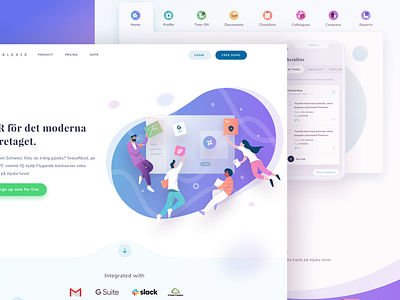
Alexis Landing Page Update
Another exploration for one of our clients that we did a few weeks back. The concept for this approach is to use a more colorful palette for the product. Which version do you think is better, this one or the previous one?
------
Interested to work together? Shoot your business inquiry to ghani@paperpillar.com
More by Paperpillar View profile
Like


