Rdio Mac App Redesign
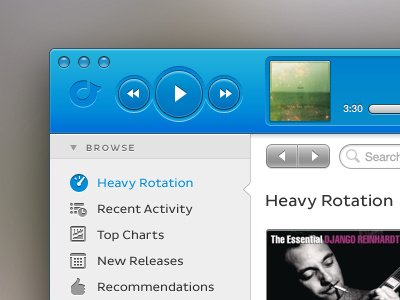
One of my all time favorite apps is Rdio, however there are things about the new version that I am not crazy about. I thought it would be fun to try my hand at redesigning it in a way that I thought would be most useful.
The major changes where moving the audio controls up top (a la version 1), moving the search field and forward/back buttons to the main content area, and making some things a little larger. Also added the "Recommendations" into the app since I find that useful on the iOS versions.
Check out the full-size attachments. I did both a light and dark version, each based on Rdio's branding (from what I can tell).
This was a blast.
More by Adam Tolman View profile
Like


