Mobile Banking App - Account Screen Redesign
52 Week Challenge. — Each week I will redesign one (1) screen from an app that I use on a daily basis. The goal is to enhance the user experience and improve the overall aesthetic of the screen.
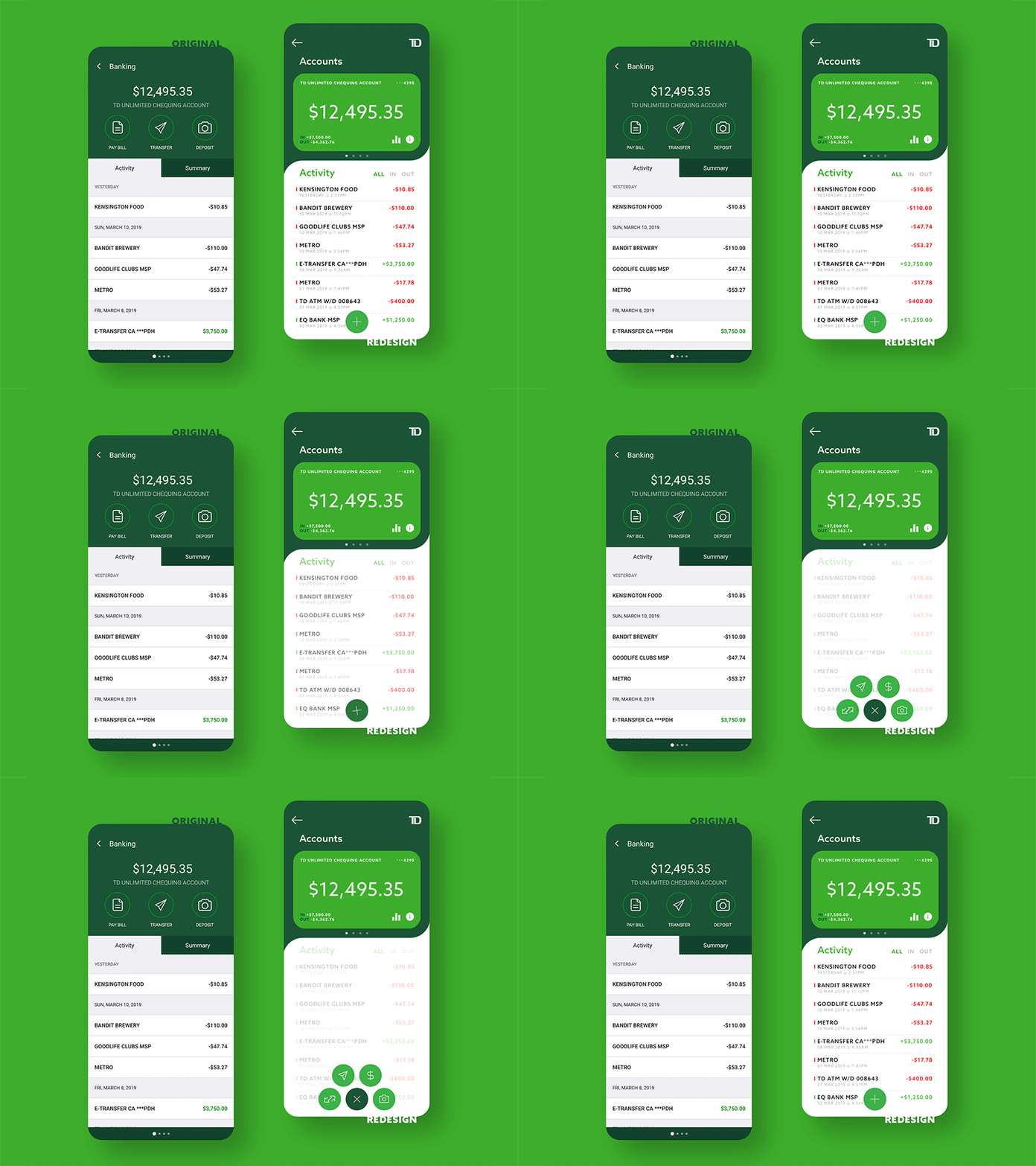
Week 1: TD's Mobile Banking App - Account Screen. — I find most, if not all, of the banking apps out there looking very uninspired and dated. So, what better place to start then here? My number 1 issue with this screen is the placement of the pagination (bottom of the left screen)—a user doesn't get to understand that they can swipe through the different accounts that they hold with the bank until it's already too late. By redesigning the top 3rd of the screen to resemble a card, and moving the pagination just below it, the user now has a clear signifier, and an understanding that they can swipe through their accounts. The account card also now displays information such as 'Income' and 'Expenses' at a quick glance, and lets the user view the account's activity through a graph.
I reorganized the Activity section of the screen to 1) make the income (green) and expenses (red) easily identifiable at a quick glance, and 2) show more information without the need to scroll down. The user can now also filter whether they want to see ALL of the transactions, or whether they would like to see the IN (income) or OUT (expenses) filtered.
Lastly, I moved all the account actions (pay bills, transfer, deposit etc.,) from the top of the screen to the bottom, so that they are more easily accessible at a thumbs reach.
What do you think?? — Show some love! Press "L". Follow and stay tuned for Week 2. — Looking to get invited to the community :)
