Identity Process


An all-natural food conference & expo hit us up for an identity last year. The team went through tireless iterations and logo concepts for this client, and a lot of these iterations offered some really exciting options for them and what their conference could be. I wanted to share some of the early concepts!
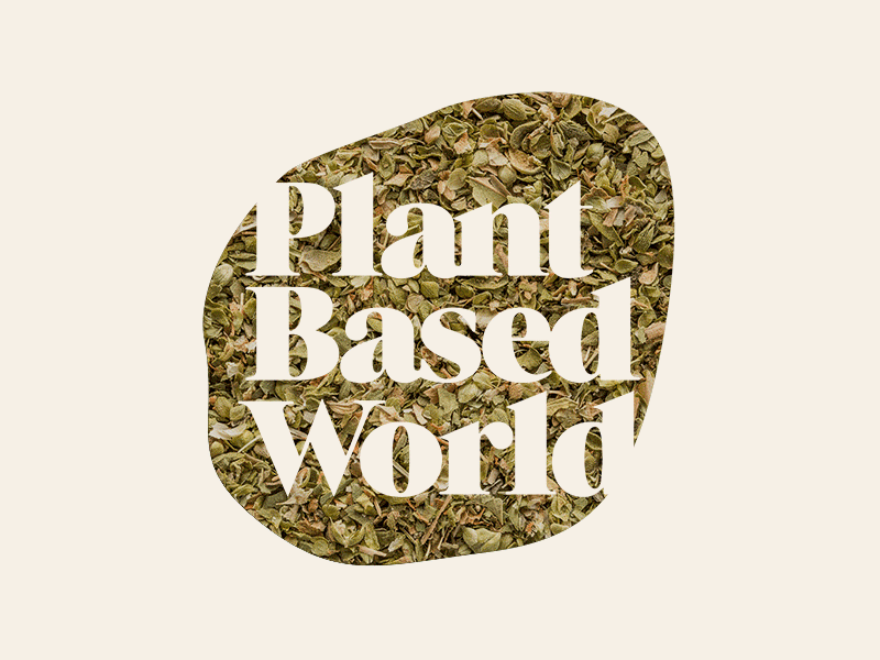
This direction was centered around an organic shape (representative of the organic shapes of fruits and vegetables) that could act as a window for conference photography, or beautiful photos of plant based foods to market the expo.
The typography is modern and friendly, but sharp, to create contrast between itself and the soft surrounding shape—and also to represent the rigidness of plant cells.
I'll share a few more over the next couple of weeks!