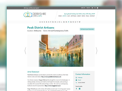
Derbyshire Open Arts artist page redesign
The main purpose for this redesign was to improve the artist pages. Over the last few years we've added various different elements to the website and it had become a bit of a Frankenstein design.
The main issue we faced on the artist pages was that some artists wrote as little as 9 words but others wrote as many as 500 so finding a system that made both ends of the scale look good was a challenge. In the end, I opted for a more modular approach to the website; I wanted the different areas of content to be clear and appear in the same position for every artist to make them more predictable for the public regardless of the content supplied.
I gave a lot of thought about grouping information together and tried to make the different types of information clearer using boxes. The next phase of work will see a focus on showing other artists in close proximity and hopefully allowing the public to plan their journeys around Derbyshire.
The attachment shows a live screenshot of an artist page, before and after the redesign.

