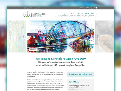
Derbyshire Open Arts homepage redesign
This year is the fourth annual event I've worked with Derbyshire Open Arts and we decided before this year's event to give the site a refresh. We wanted to improve the parts of the website that weren't as success as they could be but also stay true to the brand.
The main focus was on updating the artist pages but I also wanted to improve the typography and use of columns. CSS and webfonts have moved on in five years so I was able to work with the fonts Darts use in their brochures and I created columns with blocks of content rather than with CSS3 multi columns as it didn't work well with real content.
I also wanted to put more focus on the social elements on the homepage and shout from the rooftops how successful the event is and list how many artists and venues are involved each year.
The attachment shows the live design of the homepage before and after the redesign.

