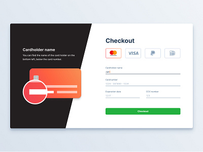
Day 2 - Credit Card Checkout
Hi guys,
Today I was challenged to create a checkout for a credit card.
For day two of this challenge I wanted to create a design with visuals inspired by flat design. The form was inspired by and uses principles discussed in the great book “Refactoring UI”.
When the user selects a field, two things will happen. The first thing is that the underline of the selected field will become a darker grey color and an orange cursor will appear. The cursor matches the color of the credit card. The second thing that will happen is that the selected input field will be highlighted on the credit card on the left side of the screen. Above this visual, the user can find a short explanation of what the selected input field is and where to find it on the credit card. To increase trust and transparency, this might also be a nice place for a company to explain why they need this piece of information.
When the user selects a different credit card company, the color of the credit card and cursor will also change to match this company’s colors.
I hope you like it and if you have any feedback, let me know.
Have a great day!
