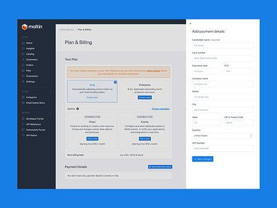
Moltin Billing Concept
Near the start of 2019 Moltin launched an updated pricing model based around revenue (read more here. It aims to provide a much simpler, scalable and fair price to all who wanted to use our platform.
This meant redesigning the way our customers can move from being trial members to paying customers.
This concept shows a few of the screens designed for this purpose. It turns out there are a lot of edge cases for billing!
---
Attachment 1: This is what a customer would see during their trial period if they haven't added any billing information.
Attachment 2: A popover component is displayed when a customer indicates they want to enter their billing details. I still want to research the minimum number of fields needed.
Attachment 3: Once a customer is subscribed and out of their trial period this is the view they'd see. Where they can enable and disable add-ons, update billing details and view past invoices.
---
It's not perfect, but it's a great first step.
Feedback is welcome and greatly appreciated! 😊


