Mihlo - Logo Concepts
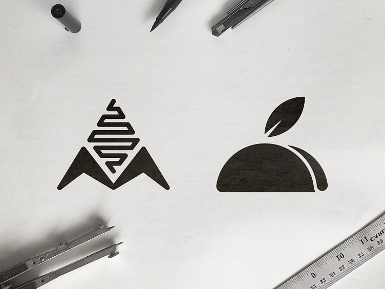
Recently got hired to develop the Brand Identity for a taco and tortilla manufacturing company, these where the 2 logomarks that stood out the most from my brainstorming.
The name Mihlo is derived from the word Millo which means Corn in spanish, hence the left concept which represents a corn cub and the letter M 🌽
They wanted to emphasise the fact that they are producing healthy tacos and tortillas, hence the taco with a leaf on the right concept 🌱
Would love to know your favorite 👊