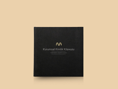
Mayday Soft Branding
Mayday Soft, who worked as a software company, preferred minimal elements in the logo and corporate identity design. In line with the structure of the brand, which is the technical service and software units, the logo design that creates awareness has been created. The basic elements of the software, numbers 1 and 0, were deformed and adapted to the brand. It is also integrated with the letter M, which forms the initial of the brand. For the logo to come to the foreground, dark color is preferred and it is provided to be complementary to the brand. The whole corporate identity was designed in a modern way
For the full presentation ;
https://medyababa.com/d/70093852/mayday-soft-corporate-identity
More by Medya Baba View profile
Like


