Nada Popcorn

A whole lotta Nada goes into this packaging.
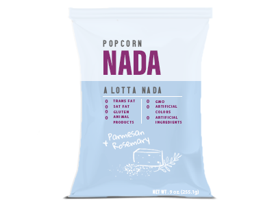
Nada Popcorn makes healthy snacks. To visually convey the idea of health, the packaging is loosely based on medical prescriptions, and medicine labels.
This snack bag is informative, clearly structured, and numerical. The hand-drawn written portion at the bottom is a whimsical play on a doctor's signature.
The typeface used is clean, energetic and sporty looking, to again, reinforce the idea of health and wellbeing.
The block colored background helps separate these two ideas: the brand name, and all the finer details of the popcorn.
This particular color palette will be used for the Parmesan + Rosemary flavor. Other flavors will feature different color palettes and illustrations in order to clearly distinguish the various flavors.