Edit Profile — Challenging Myself
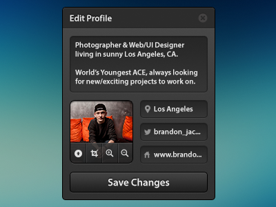
I recently decided to challenge myself to design something with a lot of content, in a little space (without it looking cramped). This is the result. I think I accomplished my goal pretty well! :)
On the Twitter and Website inputs, you may see that they are being cut off, and have a "...". I played around with using different peoples profile's that would fit better—but I decided to keep mine because it would show more of a real-world example.
The basic editing tools on top of the profile photo, is an idea I've had floating around in my head for a while. I'm glad I finally found a place to use it!
All the icons are from Thom's wonderful, FREE icon set that he recently released.
It looks a little cramped here, so view it with some more breathing room around it; here.
Moral of the story here, it's good to challenge yourself sometimes. So go out, pick a challenge, design it, and post it as a rebound to this shot! :)
