Day 1 - Sign up
Hi guys,
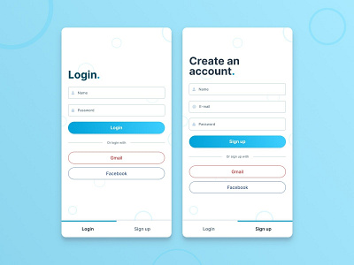
Today is the first day of the UI challenge, and I’ve been asked to create a signup page.
I wanted to create an easy to use mobile signup and sign-in page.
I got inspired by the Refactoring UI guidelines from Steve Schoger and Adam Wathan.
Since this is my first signup/sign-in page, I didn’t know exactly what information companies need from their users. After doing some research I decided to only ask for the information that was absolutely necessary. This way the signup page stays short and easy to fill out. I also added alternative ways to sign up and sign in, like Google or Facebook.
I put the tabs of the two screens at the bottom of the page, this makes it easier for users to switch because they can reach it with their thumbs.
To create a more playful look and prevent the pages from becoming too white and boring, I added multiple (potentially moving) circles to the background.
I hope you like it and if you have any feedback, let me know.
Have a great day!
