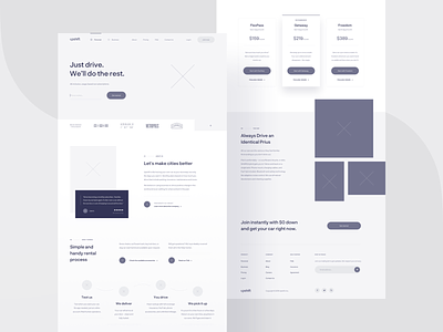
Upshift — wireframe 🌚
Hi-ya! 🙇🏼♂️
For some time now, I’ve been working on the redesign of Upshift. The designs received mad props from their advisor, @Michael Wang himself (the man behind the design of your Facebook profile). What you can see today is a homepage wireframe, where we explored the layout structure and overall user experience.
What is Upshift?
Founded in 2012, Upshift is SF-based startup offering a new model of carsharing: usage-based car subscriptions, an easy alternative to owning a car. Their plans include everything you need like full coverage insurance, maintenance, and roadside assistance. Whenever you need a car, they deliver a new clean Prius with a full tank of gas.
How we helped?
We were tasked to redesign and standardize their digital presence, working closely with their team to understand all of the user’s needs. According to the client, conversions from website to sign up page raised up 3x within the first week of launch.
Check attachment for some real pixels 🤞


