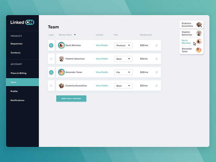
Linkedon Team page
Hi! I want to show you another screen from my last project LinkedOn. You can see more charts on my profile. LinkedOn is an automation tool to gain new contacts on Linkedin. You just have to create a sequence of connection, messages and profile views with new contacts, pick which kind of people you want to reach on Linkedin and watch the results ;)
Right now It's in the development stage.
In this project, I was responsible for the UI design. My part of work started in the middle of the project when the style was created and it still was a couple of unsolved visual problems.
The goals of the team page are: 1. Allow the user to choose a premium, pro or basic plan for the team member and allow to add a new member. 2. Show how much the plan will cost. 3. Create ease way to login to the premium account and show that the basic plan does not allow to log to the member account.
On the top right corner, we can see which account we currently use. After clicking on dropdown arrow we can choose another account to skip and quickly start using. This option is appearing also on the other pages.
Later I will show more screens and share more details!
I would love to hear some feedback, no matter it's good or bad. The comment section is waiting for you! And the "L" button is waiting also ;)
Cheers!
