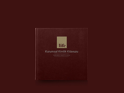
Kocaeli Life Branding
For the company that operates as the local magazine of Kocaeli, logo and corporate identity have been studied in accordance with the perception of the target audience. For the company that appeals to the upper segment, the logo family has been used as a font family. For the magazine that designs in the modern line, the logo works, which are suitable for the design on the inner pages, are preferred for the font families. In the areas where the journal is sold, the magazine is progressed through a line in such a way that the magazine comes to the fore. The logo, which is also supported by red color, is used to represent the sales target. In the corporate commodities, designs that will come to the fore and represent the line of the company are used. Simple and modern lines were preferred by using red and white combinations.
For the full presentation ;
https://medyababa.com/d/89457433/kocaeli-life-corporate-identity


