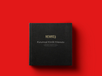
Newkee Branding
Newkee Design revealed it has made successful efforts in many projects including exclusive, prestigious and reliable personality to them from 1984 until today primarily in Kocaeli. Two red shades and black were preferred when creating the brand's identity. In order to emphasize the creativity in the design of the logo, the letter "E" was written in reverse and the beginning was determined as the middle line of the other letters. In addition to the use of preferred colors incorporate commodities, support has been gained from the motifs.
For the full presentation ;
More by Medya Baba View profile
Like


