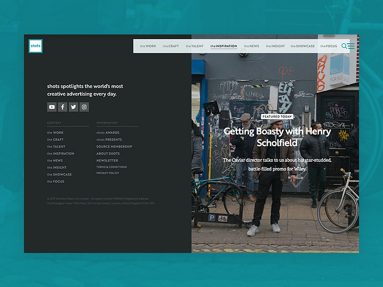
shots.net footer
I love the footers I created for the new shots.net – this one has a subtle parallax effect as you scroll down.
The footer is split 50/50 to show the company details and navigation on one side, and a large featured post on the other – this helps keep people on the site for longer and give them the next thing to read without having to think about it!
😍 😍 😍
I design and develop websites that help creative companies get more clients. Check out Folio Club to see my work and learn more about my process + pricing.
More by Mike Harmer View profile
Like
