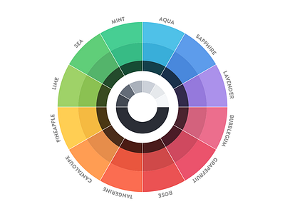
Optimal Color Wheel
Made it for you to be able to pick any colors from the wheel and make sure they visually fit together, primarily for UI design purposes. Place a solid color layer on top of it and change opacity of that layer to tone it.
The names are great to use in a variable file, and then use them for positive, negative, primary, secondary, tertiary, accent and contrast colors.
If you have any suggestions to this color scheme I'd love to hear them, just write in the comments below.
More by Mikael Cedergren View profile
Like
