Portfolio Progression
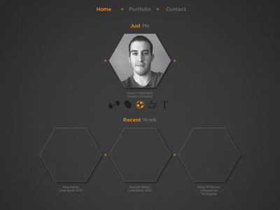
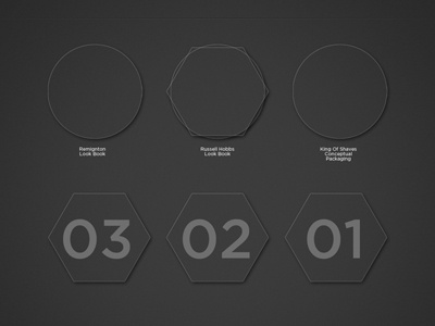
Well i decided to not go with the circle shape and decided to go with this. This is a concept for how the home page will look. Each of the symbols under my pic with highlight to say what my interests are instead of me writing a full page about me which i hate doing haha I still need to work on how im going to display blog posts and other bits but it getting there i think. Let us know what ya think :)
More by Jason Cartwright View profile
Like

