Performance Captured 3
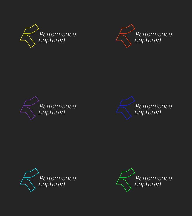
The client likes the mark but wanted it to be much thinner in stroke. He likes very light type and I've adapted an existing font to fit the style I wanted to give this. I envisage the mark (or the whole logo) changing colour according to the sport being shot, hence the range of colours in the animation.
Would be interested in some thoughts on this?
More by Owen Jones View profile
Like

