Plantr - Logo Design 3
Plantr Logo Design - Option 3
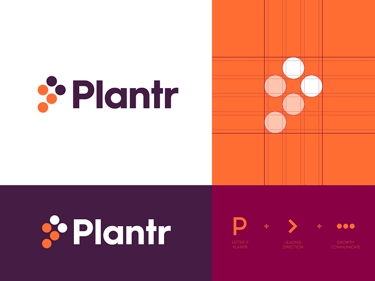
Here a new logo design concept for the project called Plantr. A service which provide tools to track and elevate your work.
While we are narrowing down all the concepts and looking which options have the most potential this concept popped up after chatting with my client. He preferred a direction where I use dots as "steps" to create a mark with and also show the letter P.
As this may look and feel simple, so I'm also a little concerned this may be have done before. But I'm still curious to know if you may or may not have seen a similar design been done before. Aiming specifically to a version which includes the > mark in it too. Let me know in the comments below what you think of this direction.
Wishing you all an amazing Friday and weekend!
_ _ _
Want to work with me? Learn more about me:

