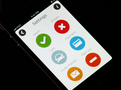
Settings
What do you think of tapping the Alerts or Emails circle to turn notifications on/off as opposed to a sliding toggle switch? Big, prominent, easy to understand.
You can see the real pixels here: goo.gl/yXQ3X
And with a slightly different color scheme here: http://d.pr/i/Zirx
Just playing with different options for my ticket app project. :)
More by Rebecca Goldman View profile
Like


