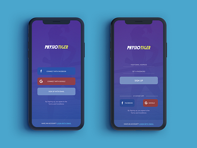
Prototype - Redesigning Signup Screens for an existing app
I had to redesign an existing login screen. The target was to get more people signing up with the service
My process:
I first took out the text boxes. Not many enjoy filling out forms. Since the target was to get more people to sign up, it was imperative to make that process easier.
The app was to be promoted mostly via social media. Having Facebook and Google options to login makes it both a familiar and easy way to sign up. Certainly beats typing a username and password
But for those who'd like to do that (and for those who don't trust social media enough to use it as a login method), there is an option to sign in with email
For the sign up with email screen, I removed all text fields except for "email address" and "password". Additional details like Name, phone number can be added later from the profile section.
Below the button, have kept the option to login with Facebook or Google

