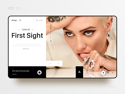
Fashion Web
Why are the same content elements so good?
Or why is it so good?
Although the design has no fixed number,
But there are still some basic principles that can be followed.
1 intimacy
Items that are related to each other should be close together and grouped together. If there are close intimacy between multiple items, they form a visual unit rather than multiple isolated elements. Straightforward, different elements such as figures, tables, and texts are each a small typesetting unit.
2 alignment
Each element should have some visual connection to another element on the page. On the basis of obvious alignment, the alignment rules can be broken occasionally. This one is relatively simple, everyone will set a lot of control lines when typesetting.
3 repetitions
Colors, shapes, materials, spatial relationships, line widths, fonts, sizes, and images can be repeated to increase rationality and enhance unity.
4 contrast
The basic idea is to avoid too similar elements on the page. If the elements, such as font, color, size, line width, shape, and space, are different, make them completely different. By highlighting the highlights of the content you want to emphasize.


