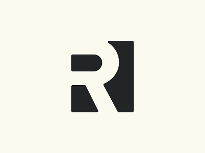
Render Equity Final Branding
Finally, here is the logo they ultimately ended up going with. More simple and clean than some of the other ones but still recognizable and timeless.
My thought behind the mark is a subtle representation of land lines or roads from an above view. Also, yes... it's just flat out fun to work in some sort of negative space if you can.
Anyways, thank you all for letting me flood your feed with black and white the last week or so.
More by Tyler Anthony View profile
Like

