Identity for charitable foundation
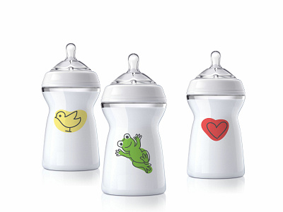
Sure Start Charitable Foundation is a project of KPMG company to help parents of children with special needs. The main objectives of the corporate identity are to make information available to parents, and a form of communication with them is friendly. It is the elements of the style that resemble children's drawings with their fingers, because children love to draw. And special children are no exception. The corporate colors of the style are the colors of nature: blue, yellow, orange and green - calm, soft. The logo is an image of the super-hero of the kid and the inscription handwritten font. This font is also part of the foundation's corporate identity. Also developed a system of characters and elements. Elements work as communication assistants and create a fun pattern. Stickers with fun characters were also used. The elements of style work as part of a lively and fun designer and are very popular with children and their parents.
