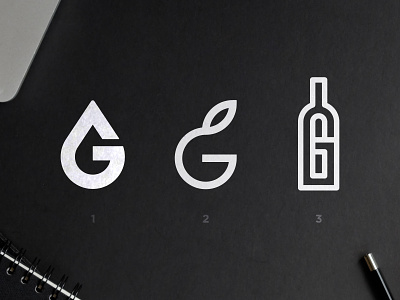
12 Groves - Logo Concepts
Here's a logo i'm developing for a company that does worldwide delivery of Premium Olive Oils. The client mentioned on the brief that he was looking for a minimalist, expensive looking and modern branding.
Out of the many options that you may have seen on my Instastories for the past days, these 3 where the ones that stood out the most, here's their meaning:
1. G with a drop of oil on it's negative space.
2. Rounded G, representing an Olive with a leave on the top of it
3. A bottle of olive oil forming a G
Both me and client prefer the first one because of how strong it is, while conveying the premium values. What about you? Let me know in the comments. Have a good week 👊
--
📨 Got a project? Let's work together! Email: wisecrafted@gmail.com
--
More by Wisecraft View profile
Like
