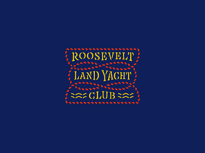
RLYC Logotype
One of the most difficult logotypes I've worked on for being so “simple”. Spacing / drawing this bad boy was a monster. I drew each letterform inside their respective glyph then pieced together the logotype as components within another glyph.
A truly hybrid lettering/type design piece because each line needed different character widths and completely unique spacing all the while needing to feel cohesive and uniform. Ah what fun!
More by Scott Biersack View profile
Like

