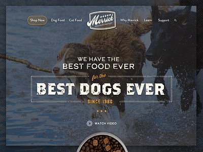
Website Hero Image
This was an early exploration I did for the homepage hero section of Merrick Pet Care's new website. Overall, this direction was a little too rough and rugged. We moved into a direction that showed off the actual food ingredients and was overall warmer and lighter in tone.
More by Lindsay Schofield View profile
Like
