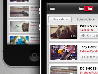
YouTube iPhone
This is something I did late last night after installing CS6, I wanted to get to grips with it so I set out on a little experiment.
This shot shows my take on the YouTube iPhone application, the idea was to de-clutter the UI and make more use of screen real estate as well as tailoring the app towards YouTube's new style.
More by Danny Keane View profile
Like


